Why the clipboard had to go
I'd sat in waiting rooms like this enough times to know exactly where it broke down. Usually it was a Spanish-speaking patient, sometimes someone else, but the problem never changed: a front desk trying to hold everything together with a clipboard and shouted names, and people in wheelchairs, people with cognitive impairments, people arriving anxious, with no way to understand what was happening or when their turn would come. So I went home and built the fix.
What came out of that is a full production system. A priority queue engine that handles clinical urgency. Real-time multi-device sync across every iPad in the room, HIPAA-compliant authentication, a three-channel notification chain with automatic fallback. Little's Law analytics that tell the clinic exactly when to add staff. And 12-language support including RTL Arabic. All of it built for a waiting room that couldn't afford to get it wrong.
On paper the requirements were simple: a fleet of iPads in the waiting room, the same live queue on every screen, staff alerts when the line changed, and a check-in flow that didn't punish people for being confused, late, or unable to speak English. The hard part is that each of those pulls against the others. A queue that's too rigid fails the patient who needs to jump ahead. Too loose and it's chaos. A notification system with one delivery path fails the first time a number is bad or a carrier is down. So I built around the parts that couldn't lie: queue position, wait time, live state, and a fallback chain that keeps trying when the clinic network does what clinic networks do.
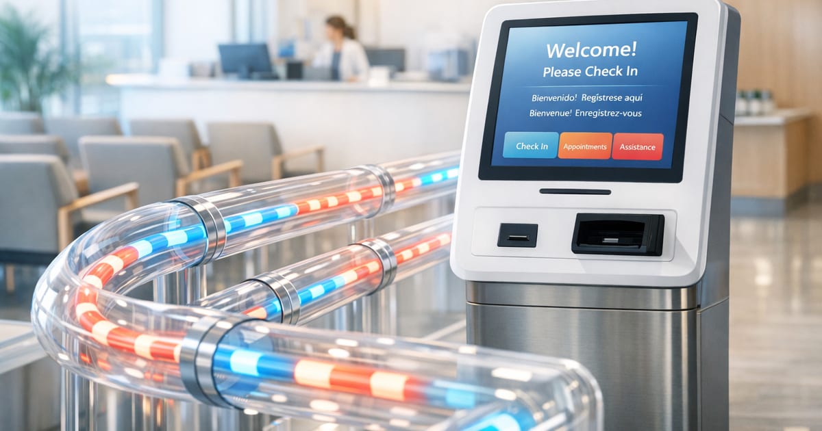
The part I'm proudest of is that the kiosk turned into a small operational machine, one that makes a waiting room legible.
The queue is not FIFO, and that matters
The queue engine is the heart of the kiosk. A specialty waiting room isn't a coffee shop line; urgency changes the order, and the order changes the experience. So the queue logic in QueueManager uses priority-aware placement instead of a flat first-in, first-out model. Urgent patients slot in after other urgent patients but before high priority. High priority goes after urgent and high, but before normal. That distinction is what lets a queue absorb real clinical reality.
The naive version would just append each patient to the end and call it fairness. Which breaks immediately when a patient arrives in crisis. It also breaks when staff need the line to reflect clinical priority without manually shuffling names around. Better to calculate the insertion point from priority, then recalculate everything downstream in one pass, so the room sees a consistent order instead of a half-updated mess.
Here is the pattern I built around that logic:
// Priority-aware positioning from QueueManager
// URGENT patients go ahead of HIGH and NORMAL, but after other URGENT patients.
// HIGH patients go ahead of NORMAL, but after URGENT and HIGH.
const calculatePosition = (newEntry, queueEntries) => {
  let position = 1;

  for (const entry of queueEntries) {
    if (newEntry.priority === 'urgent') {
      if (entry.priority === 'urgent') {
        position++;
      }
    } else if (newEntry.priority === 'high') {
      if (entry.priority === 'urgent' || entry.priority === 'high') {
        position++;
      }
    } else {
      position++;
    }
  }

  return position;
};

const calculateWaitTime = (position, avgServiceTime, staffAvailable, priority) => {
  const baseWait = (position * avgServiceTime) / staffAvailable;
  return priority === 'urgent' ? baseWait * 0.5 : baseWait;
};
What surprised me was how much the wait-time formula matters to the room's emotional temperature. A patient doesn't experience "queue position" as an abstract integer. What they experience is whether someone can tell them, in their language, roughly how long the wait will be. That's why the urgent multiplier exists, and why the estimate is tied to both position and staff availability instead of pretending the clinic has infinite capacity.
The downstream recalculation needed the same care. If a priority patient cuts in, every later patient's position and wait time has to shift with it. A partial update would leave the kiosk screens disagreeing with each other for a few seconds, and in a waiting room those few seconds feel like a bug you can hear.
The ripple update is the real trick. Once the new patient is inserted, the queue does more than “move one slot.” Every affected entry gets a fresh position and a fresh wait estimate in the same pass, which keeps the room coherent. I also kept a 50-patient capacity limit and duplicate check-in prevention so a confused patient does not accidentally queue twice and create a phantom second self on the wall screen.
The check-in flow had to be all or nothing
The check-in orchestration in CheckInService is where the kiosk stops being a form and becomes a transaction. I wanted six steps that either complete together or stop together: validate patient data, upsert the patient record, store the check-in with GPS coordinates, add the patient to the priority queue, generate a confirmation number, and fire notifications. If queue assignment fails, confirmation and notifications do not run. That is not a nice-to-have; it is how I keep the system from telling a patient they are checked in when the queue never accepted them.
A naive implementation would scatter these steps across UI handlers and hope the happy path stays happy. I have seen that movie. The first time a network call flakes out, the UI tells the patient one story, the database tells staff another, and the waiting room gets to enjoy the confusion. I wanted the opposite: a single orchestration point that owns the sequence.
The dependency chain is what matters. Validation can warn about missing insurance or emergency contact without blocking care. Upserting by first name, last name, and date of birth prevents returning patients from multiplying in the system. Location gets attached to the check-in, but the flow does not turn into a location test that blocks care if GPS is having a bad day. And once queue assignment succeeds, the confirmation number and notifications become meaningful instead of decorative.
That design fits the clinic better than a strict form-filling mindset ever would. People arrive stressed, sometimes in pain, sometimes unable to explain themselves well. The system had to be forgiving in the right places and strict in the places where consistency matters.
Real-time sync is what makes the room feel alive
Every iPad in the waiting room shows the same queue state, and that only works because QueueSubscription listens to Supabase real-time channels. The clinic-wide subscription uses a channel named with the clinic ID and listens to postgres_changes on the queue entries table filtered by clinic. That means when one kiosk accepts a patient, the others do not wait around for a refresh button; they update as soon as the database changes. Supabase’s realtime channels are built around exactly this pub/sub style of change delivery (docs), which is why it fits this part of the system so well.
The naive route would be polling. Polling is fine when you want stale data at a predictable interval. It is not fine when a waiting room needs to feel synchronized across multiple screens. Real-time channels give me the shared state I needed without turning the app into a metronome.
The patient-specific channel is the other half of the story. A patient can have their own subscription for status changes, which lets the system notify them when their position moves, when their wait time drops, or when they are close to being called. Those triggers are not arbitrary; they are tuned to the experience I wanted in the room.
// QueueSubscription pattern
// Clinic-wide channel for shared queue state, plus patient-specific channels for status updates.
const clinicChannel = supabase.channel(`queue_${clinicId}`);
const patientChannel = supabase.channel(`patient_${patientId}`);

clinicChannel.subscribe();
patientChannel.subscribe();
The non-obvious part is the notification threshold logic layered on top of the subscription. If a patient’s position jumps forward by 3 or more, they get an alert. If the estimated wait drops by 10 or more minutes, they get notified. When they are within 3 positions of being called, they get an “approaching your turn” message in their language. That is the difference between a passive screen and a system that keeps people oriented.
I also added exponential backoff reconnection with a maximum of 5 retries because the clinic Wi‑Fi is not a cathedral. It hiccups. It drops. It comes back. The subscription layer had to assume that reality and recover without making the staff restart the whole app, which is the same general failure mode AWS recommends handling with backoff rather than immediate retry storms (AWS Builders’ Library).
The notification system had to fail sideways, not fail closed
The notification layer in NotificationService is built around three channels: Twilio SMS, SendGrid email, and Expo push notifications. Staff set preferences in their profile, and the service uses those preferences to decide how to deliver updates. That matters because some alerts are urgent, some are informational, and some need to survive a single channel going down.
A brittle design would pick one channel and hope for the best. I did not want the clinic to learn about a queue capacity warning only if one vendor was having a good day. So I built a fallback chain: if SMS fails, it falls back to email. Every attempt is logged in notification_logs, and batch delivery handles shift-change alerts. The system notifies staff on check-in, priority changes, and queue capacity warnings.
// NotificationService fallback pattern
// SMS is attempted first; if it fails, the service falls back to email.
const sendWithFallback = async (payload, preferences) => {
  try {
    return await sendSMS(payload);
  } catch {
    return await sendEmail(payload);
  }
};
The interesting bit is not that there is a fallback. It is that the fallback is not treated as an exception path that nobody watches. Logging every attempt gives me a record of what actually happened, which matters in a clinic where missed messages are not a cosmetic problem. The batch delivery path also keeps shift-change alerts from becoming a storm of one-off messages.
I wanted the staff to feel informed, not hunted by notifications.
I learned the hard way that GPS can lie politely
The location service taught me one of the ugliest lessons in the system. My first version accepted whatever cached GPS coordinate the device already had, which meant a patient could technically check in from home if the iPad or phone had stale location data from earlier. That was too permissive, and it was my mistake.
The fix in GeolocationService is a fresh-first strategy. getLocationWithFallback() tries fresh GPS first with a 15-second timeout race, then falls back to a cached location only if the fresh call fails and the cache is no more than 5 minutes old. The result is checked against a high-accuracy threshold of 100 meters. If accuracy is worse than that, the system warns but still accepts the check-in, because indoors GPS gets sloppy and I did not want to block access to care over a bad satellite day.
That balance mattered to me. I wanted a guardrail, not a gate slammed shut in the face of a patient who had already made it to the building.
// GeolocationService pattern
// Fresh GPS first, then a short-lived cache fallback, with a 100-meter accuracy threshold.
const getLocationWithFallback = async () => {
  const freshLocation = await getFreshLocation(15000);
  if (freshLocation) {
    return freshLocation;
  }

  const cachedLocation = getCachedLocation(5 * 60 * 1000);
  return cachedLocation || null;
};
What I changed in my head after that bug was simple: location is evidence, not a verdict. If the device can prove the patient is near the clinic, great. If it cannot, the system should still let the patient in rather than turning the kiosk into a border checkpoint.
The kiosk knows where it is, and which clinic it belongs to
That same location logic extends further than a single building. The system is not single-location. Every iPad knows which clinic it belongs to by resolving its GPS coordinates against a live database of clinic locations using the Haversine formula. The ClinicMapper class in the ClinicMapper module handles this: it queries all active clinics, calculates distance to each one, returns the nearest match with a confidence score, and determines whether the device is inside that clinic's geofence.
// Nearest clinic resolution with confidence scoring — src/location/ClinicMapper.ts
async findNearestClinic(
  latitude: number,
  longitude: number,
  maxDistance: number = 5000
): Promise<ClinicMatch | null> {
  const clinics = await this.getClinics();
  let nearestClinic: Clinic | null = null;
  let shortestDistance = Infinity;

  for (const clinic of clinics) {
    const distance = this.calculateDistance(
      latitude, longitude,
      clinic.latitude, clinic.longitude
    );
    if (distance <= maxDistance && distance < shortestDistance) {
      shortestDistance = distance;
      nearestClinic = clinic;
    }
  }

  if (!nearestClinic) return null;

  const confidence = this.calculateConfidence(shortestDistance);
  const geofenceRadius = this.getGeofenceRadius(nearestClinic);
  const isWithinGeofence = shortestDistance <= geofenceRadius;

  return { clinic: nearestClinic, distance: shortestDistance, confidence, isWithinGeofence };
}

private calculateConfidence(distance: number): number {
  if (distance <= 50)   return 1.0;
  if (distance <= 100)  return 0.9;
  if (distance <= 250)  return 0.8;
  if (distance <= 500)  return 0.7;
  if (distance <= 1000) return 0.6;
  if (distance <= 2000) return 0.5;
  return 0.3;
}
Each clinic has its own configurable geofence radius in the database, defaulting to 500 meters, tightening to 100 meters for high-security settings:
// Per-clinic geofence configuration — src/location/ClinicMapper.ts
private getGeofenceRadius(clinic: Clinic): number {
  const settings = clinic.settings as any;
  if (settings?.geofence_radius) return settings.geofence_radius;
  if (settings?.strict_geofencing) return 100; // strict mode
  return 500; // default 500m
}
The same logic lives at the SQL layer for server-side queries. The find_nearest_clinic function in the migrations mirrors the Haversine calculation so the backend can resolve clinic association without trusting the client:
-- SQL-layer nearest clinic — supabase/migrations/20250115_003_create_location_tables.sql
CREATE OR REPLACE FUNCTION find_nearest_clinic(
  device_lat DECIMAL,
  device_lon DECIMAL,
  max_distance_meters DECIMAL DEFAULT 5000
) RETURNS TABLE (
  clinic_id UUID,
  clinic_name TEXT,
  distance_meters DECIMAL
) AS $$
BEGIN
  RETURN QUERY
  SELECT c.id, c.name,
    calculate_distance(device_lat, device_lon, c.latitude, c.longitude) as distance
  FROM public.clinics c
  WHERE c.is_active = true AND c.deleted_at IS NULL
    AND calculate_distance(device_lat, device_lon, c.latitude, c.longitude) <= max_distance_meters
  ORDER BY distance
  LIMIT 1;
END;
$$ LANGUAGE plpgsql STABLE;
Every check-in stores a location_capture record and a clinic_association record, a full audit trail of which device, at what coordinates, was matched to which clinic, with what confidence, at what time. Staff are scoped to their clinic via RLS. Analytics are per-clinic, and so are the queues.
Adding a second location is a row in the clinics table. The queue, the analytics, the staff scoping, and the geofence all follow automatically.
The analytics are there to keep the clinic ahead of the line
This is where the system stops reacting and starts explaining itself. AnalyticsCollector computes queue metrics using Little's Law, with arrival rate defined as total check-ins divided by hours span, service rate defined as completed patients divided by hours span, and utilization defined as arrival rate divided by service rate. I used that because clinic managers don't need prettier charts; they need to know when the queue is saturating and when another staff member is needed.
The naive dashboard would just show counts. Counts are fine until they aren't. A count tells you what happened; utilization tells you whether the room is heading toward overload. Average queue length is calculated as arrival rate multiplied by average wait time divided by 60, and the daily metrics track total check-ins, average wait time, peak hour, no-show rate, language distribution, and service time average. Enough to make the queue visible as a system instead of a pile of events.
The threshold I care about most is 0.85. If utilization rises above that, the clinic needs another staff member now. Not later. Now. That number hands a manager something concrete instead of a vague feeling that the waiting room looks busy.
The five-minute cache in the analytics layer keeps the database from getting hammered while still giving the dashboard a fresh enough view to be useful. Peak hour analysis then shows when bottlenecks form, which is the kind of operational truth you can actually schedule around.
The point of this layer is not prettier charts. It's turning "the waiting room feels busy around 10 AM" into "utilization hit 0.91 at 10 AM, here is the number you bring to a staffing meeting." Analytics should turn a feeling into a decision someone can actually make.
The multilingual layer is not decoration
The app supports 12 languages, including RTL Arabic. That wasn't a branding decision; the room needed it. The language context updates the whole app, and the patient's language preference is stored so returning visitors see their language first. That means the kiosk doesn't ask a patient to relearn the room every time they arrive.
I also made the language choice visible everywhere it matters: labels, buttons, and notifications. That consistency matters more than people think. A translated welcome screen followed by an English-only confirmation isn't multilingual. It's a tease.
The real win is that the language layer and the notification layer share the same assumption: a patient should be able to understand what's happening without asking for help in the middle of a crowded waiting room. That's a system design decision, not a UI flourish.
HIPAA shaped the architecture as much as the clinic did
The kiosk lives in a public room, so I couldn't treat the iPad like a private laptop. The security model runs through the workflow instead of sitting on top of it: audit logging on every data access, RLS policies scoping staff to their clinic, 30-minute session timeouts, OTP authentication rate-limited to 3 attempts per 15 minutes, encrypted AsyncStorage. No PHI leaves the device unencrypted.
The design choice I respect most is that security doesn't get to cancel care. A patient can still check in even if location is uncertain. The clinic can still operate if one notification path fails. The guardrails protect the data without making the room harder to use.
Why this system feels different to me
I built it because I'd sat in enough waiting rooms like that one to know where the friction lands on real people. The queue engine had to understand urgency, and the real-time layer had to keep every iPad in sync. The notification chain had to survive failure. The location logic had to be skeptical without being cruel, and the analytics had to tell the truth early enough to matter.
That combination is what makes the kiosk feel alive to me. It's software that does more than record arrivals; it helps a room full of strangers understand where they are in the day, in their own language, without making them ask twice.